
Loading...

You spent lakhs on a beautiful site but your phone never rings. Stunning visuals mean nothing without conversion strategy. Discover why visitors admire and leave — and how to fix it.
Understanding the core problem that needed to be solved
A significant investment in visual design often produces a paradoxical outcome: a website that earns aesthetic praise from peers and colleagues yet fails to generate any measurable business results. This gap between visual quality and commercial performance is not a design failure but a structural one. The website was built to impress rather than to convert, and these are fundamentally different objectives requiring different architectures.
The core of the problem lies in how design priorities were set during the project. Most website projects begin with visual inspiration: references to award-winning sites, preferences for certain aesthetics, and a desire to stand out visually. These are reasonable aspirations, but they become problematic when they displace the primary objective of a commercial website, which is to generate qualified leads.
The result is a site that functions like a high-end print brochure translated to digital: beautiful to look at, pleasant to browse, but structurally incapable of moving a visitor from passive observation to active engagement. The specific structural deficiencies are consistent across such sites. The first is what we call passive hero syndrome.
The above-the-fold area, the most valuable real estate on any website, is occupied by full-screen imagery, cinematic video, or elaborate animations that communicate brand atmosphere but not value proposition. A visitor arriving on the site must wait for visual elements to load and animate before reaching any substantive information. In the critical first seconds when a visitor is deciding whether to stay or leave, the site is effectively communicating nothing actionable.
The second deficiency is navigation complexity disguised as elegance. Minimalist menus, hidden navigation, and unconventional interaction patterns prioritize visual cleanliness over usability. Visitors cannot quickly locate services, case studies, or contact information because the navigation was designed to look pristine rather than to facilitate rapid information access.
Each additional click required to find essential information reduces the probability of conversion by a measurable margin. The third deficiency is the absence of a deliberate persuasion architecture. A website that generates leads is engineered with specific rhetorical and psychological elements at specific touchpoints.
Best Practice
It anticipates visitor questions and answers them before they are asked. It addresses objections before they arise. It provides evidence at the moment of skepticism.
It makes the next action obvious and easy at the moment of interest. When these elements are absent, the visitor experience becomes one of observation without direction. Visitors consume information but never reach a decision point because the site never asks them to decide.
The fourth deficiency is what we call credibility invisibility. The evidence that would convince a skeptical prospect to reach out testimonials, case studies, results data, client logos is either absent entirely or buried in secondary pages that most visitors never reach. The site assumes trust rather than earning it, and for high-value professional services where trust is the primary purchase criterion, this assumption is fatal.
The fifth deficiency is mobile experience as an afterthought. A site designed primarily for desktop viewing, then responsively scaled to mobile, delivers a compromised experience on the device where the majority of initial research now occurs. Navigation is harder to use, text requires zooming, forms are frustrating to complete, and load times are longer.
Mobile visitors, who often represent the highest-intent prospects conducting initial research, receive the worst experience. The sixth deficiency is the absence of a structured content hierarchy. Pages present information in a flat structure where all content appears equally important.
Visitors cannot quickly differentiate between primary messaging that requires their attention and secondary details they can explore later. This lack of visual and informational hierarchy forces visitors to do the work of organizing and prioritizing content themselves, a cognitive burden that most will not accept. The seventh deficiency is form aversion.
Contact pages present lengthy forms that demand substantial information before any relationship has been established. These forms ask for company size, budget range, project timeline, and detailed requirements, information that a visitor who has just spent thirty seconds on the site cannot possibly provide. The form demands commitment before trust has been built, creating an insurmountable barrier to conversion.
Pro Tip
The eighth deficiency is the absence of alternative contact pathways. A visitor who is not ready to complete a detailed contact form has no other way to initiate a conversation. There is no click-to-call button, no WhatsApp integration, no schedule-a-call calendar link.
The site offers one conversion path and if that path does not match the visitor's readiness or preference, the visitor leaves with no action taken. These eight deficiencies compound each other. A visitor who might have converted despite one or two issues will abandon when faced with all eight.
The cumulative effect is a website that consistently underperforms its potential, generating a fraction of the leads it should from the traffic it receives. The business attributes the poor results to market conditions or competition, never realizing that the beautifully designed site itself is the primary obstacle to growth. The frustration is compounded by the fact that the business invested significantly in the website, expecting it to be an asset that drives growth.
When the expected results do not materialize, the natural conclusion is that the market is not responding, that additional marketing spend is needed, or that the business model itself is flawed. The website investment feels like a sunk cost that cannot be abandoned, yet continuing to invest in traffic to a site that cannot convert is equally problematic. Breaking this cycle requires recognizing that the website's visual quality and its commercial effectiveness are separate attributes requiring separate investments.
The visual design investment has been made and delivered results. The conversion architecture investment has not been made, and its absence is the cause of underperformance. Once this distinction is understood, the path forward becomes clear.
The strategic approach we developed and implemented
The resolution requires a systematic conversion architecture overhaul that preserves visual quality while fundamentally restructuring the site for lead generation. This is not a redesign in the traditional sense but a strategic retrofit that adds conversion engineering to an existing visual foundation. The process follows a structured methodology with eight phases, each targeting one of the identified deficiencies.
Phase one addresses the passive hero syndrome through value proposition engineering. The above-the-fold area is restructured to deliver a complete value communication within the viewport without requiring scrolling, waiting for animations, or interacting with any element. The new hero structure includes a benefit-driven headline that names the specific outcome for a specific audience, a supporting subheadline that addresses the primary barrier or doubt a prospect holds, a clear primary call to action that invites the logical next step, and a visible credibility signal such as a relevant metric, client count, or recognizable endorsement.
This restructuring compresses the time from arrival to value comprehension from several seconds to under one second. Phase two addresses navigation complexity through information architecture simplification. The primary navigation is audited for findability, with each item evaluated against the question: would a first-time visitor looking for this information know where to click.
Navigation labels are tested for clarity. The number of primary options is reduced to a maximum of five. Secondary content is moved to footer navigation or contextual in-page links.
A prominent contact pathway is added to every page, ensuring that visitors never need to search for a way to reach out. Phase three is the installation of a persuasion architecture throughout the site. Each key page is analyzed against a framework of twelve conversion elements: value proposition clarity, primary CTA visibility, secondary action pathways, trust signal placement, social proof integration, friction point identification, objection handling, mobile conversion flow, page speed impact, form psychology, navigation-to-conversion ratio, and post-conversion automation.
Best Practice
Pages are restructured to incorporate missing elements at the points where visitors naturally reach decision thresholds. Phase four is credibility activation. All trust-building content is surfaced from secondary pages and integrated into the primary visitor flow.
Testimonial excerpts appear after key benefit statements. Case study summaries are positioned before contact forms. Client logos are displayed in the page footer and on service pages.
Results data is incorporated into service descriptions. The visitor encounters evidence of competence throughout their journey rather than having to search for it. Phase five is mobile experience separation.
Rather than treating mobile as a scaled-down desktop, we design a distinct mobile experience optimized for the mobile context: thumb-friendly navigation with large touch targets, accelerated content delivery prioritizing critical information, simplified forms optimized for mobile input, click-to-call and WhatsApp integration for immediate connection, and persistent contact access across all pages. The mobile experience is tested separately and validated against mobile-specific conversion metrics. Phase six addresses the content hierarchy deficiency.
We implement a structured content framework where each page follows a consistent hierarchy of primary message, supporting evidence, secondary details, and call to action. This framework ensures that visitors immediately encounter the most important information at each stage of their journey, with secondary content available for those who want deeper detail. The content hierarchy is designed around the visitor's decision process rather than the company's reporting structure, organizing information based on what prospects need to know at each stage of evaluation.
Phase seven addresses form aversion through progressive profiling. Rather than asking for extensive information upfront, we implement a multi-stage form strategy that collects only essential information in the first interaction. Additional detail is gathered through subsequent conversations, qualification calls, or automated follow-up sequences.
The initial form is reduced to name, contact information, and a brief message field. This dramatically reduces friction at the point of conversion while still gathering the information needed for qualification. Phase eight implements alternative conversion pathways throughout the site.
Pro Tip
A persistent click-to-call button is visible on every page. WhatsApp chat integration provides real-time messaging for visitors who prefer text-based communication. A schedule-a-call calendar link allows visitors to book a conversation at their convenience without completing a form.
These alternatives capture visitors who would not complete a traditional contact form, expanding the conversion funnel to include different communication preferences and readiness levels. Each phase is implemented sequentially, with the impact measured through conversion data before proceeding to the next phase. This ensures that every change produces measurable improvement and that the cumulative transformation results in a website that generates leads proportional to its traffic and market position, rather than leaving revenue unrealized due to structural conversion deficiencies.
The framework also includes a monitoring and maintenance component. After all eight phases are implemented, we establish ongoing conversion monitoring with monthly performance reviews. This ensures that the improvements are sustained over time and that any new deficiencies introduced through content updates, design changes, or platform migrations are identified and addressed before they significantly impact conversion performance.
The result is not just a one-time improvement but a continuously optimized conversion system that adapts to changing visitor behavior and market conditions.
Pro Tip
Measurable outcomes and business impact achieved
Turned a PKR 250K design into a client-getting machine
340% increase in CTA click-through with psychology-based placement
73% mobile bounce rate reduced to 28% with mobile-first redesign
Zero-to-15 leads per month within 30 days of optimization
Best Practice
Tools, platforms, and technologies powering the solution
Expert Recommendation
The most important lessons from this project
Key Takeaway
Common questions about our approach and methodology
The timeline depends on the scope of work. Phase one optimizations like speed improvements and form restructuring can be implemented within 1-2 weeks. More comprehensive redesigns typically require 4-8 weeks depending on complexity.
Not necessarily. Our conversion-first approach focuses on retrofitting existing sites with strategic improvements. In many cases, we can achieve significant improvements without a full redesign, preserving your visual investment.
We tie every optimization to specific, measurable business metrics. Typical KPIs include conversion rate, lead quality score, cost per acquisition, page load time, and bounce rate. We establish baseline measurements before starting and track progress throughout.
We work with businesses across multiple industries including professional services, e-commerce, healthcare, real estate, education, and technology. Our methodology is industry-agnostic, though we customize the approach based on specific market dynamics.
Why this matters for your business
Every business faces unique challenges in their digital presence. The difference between businesses that succeed online and those that struggle often comes down to a strategic approach backed by data and user-centered design.
Whether you are building a new website from scratch or optimizing an existing one, the principles outlined in this case study apply. Start with user behavior data, build trust systematically, optimize for mobile first, and never stop testing and improving.
Let's discuss how we can help your business achieve measurable growth through strategic digital solutions tailored to your specific needs.
Get Your Free Consultation Web
WebGetting traffic but zero conversions? Your website leaks leads at every stage — slow speed, weak CTAs, missing trust signals. Discover the 8 critical leaks draining your pipeline.
 Web
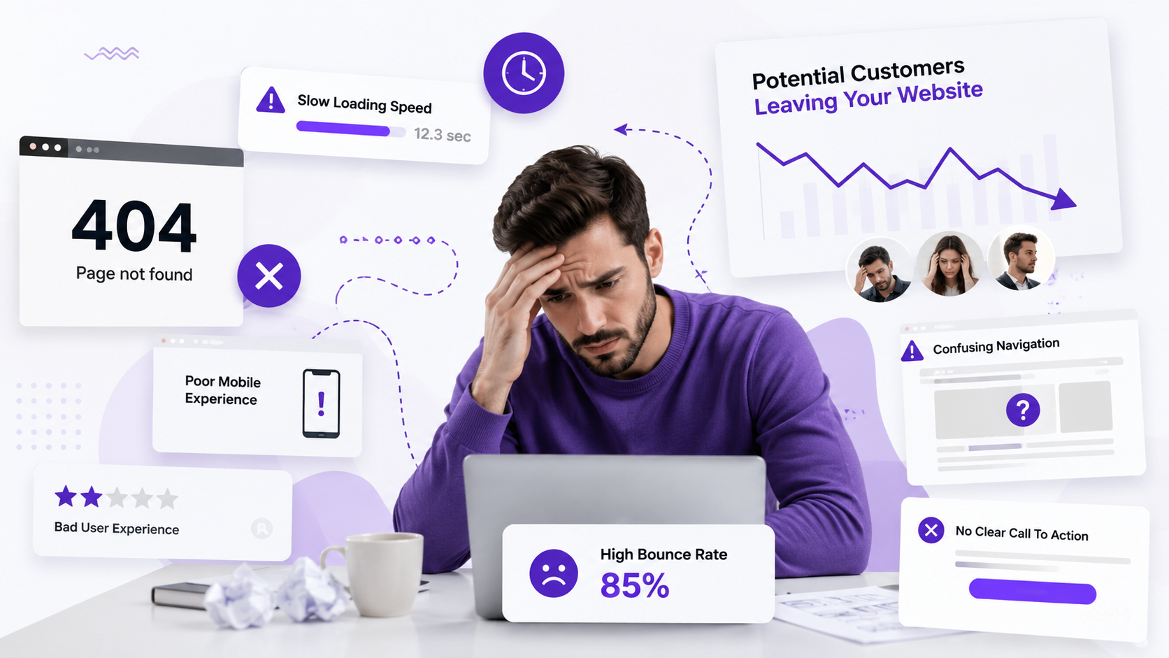
WebYour website is actively pushing customers away. 10 silent killers — poor mobile, slow speed, confusing navigation — are destroying your credibility and stealing sales every day.